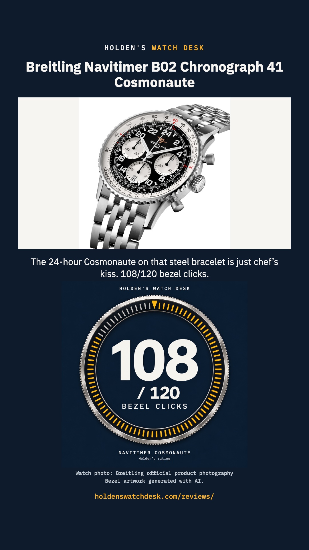
Breitling’s new Cosmonaute is just chef’s kiss
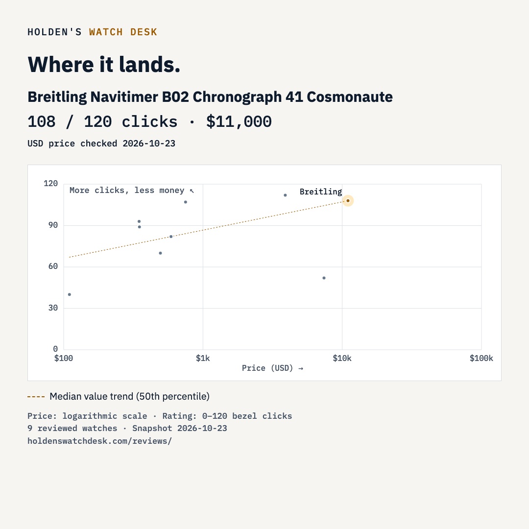
The 24-hour Breitling Cosmonaute on its seven-row steel bracelet gets 108/120 bezel clicks. $11,000 USD; first impressions from release images.
Read reviewMy watch reviews, rated out of 120 bezel clicks.
The 24-hour Breitling Cosmonaute on its seven-row steel bracelet gets 108/120 bezel clicks. $11,000 USD; first impressions from release images.
Read review
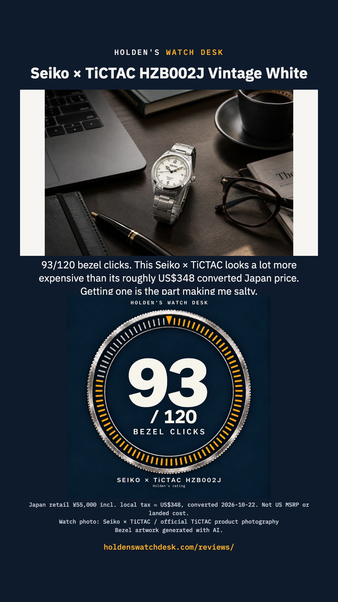
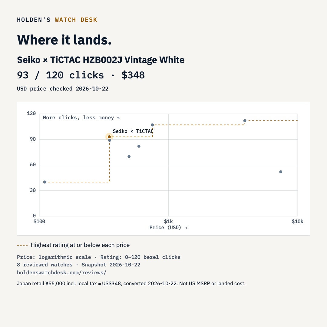
The Seiko × TiCTAC HZB002J looks expensive, costs about US$348 converted from Japan retail, and gets 93/120 bezel clicks. First look, not hands-on.
Read review
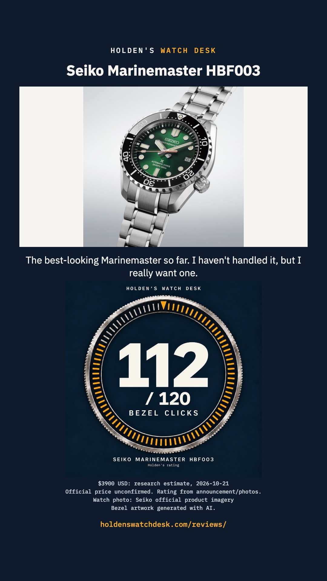
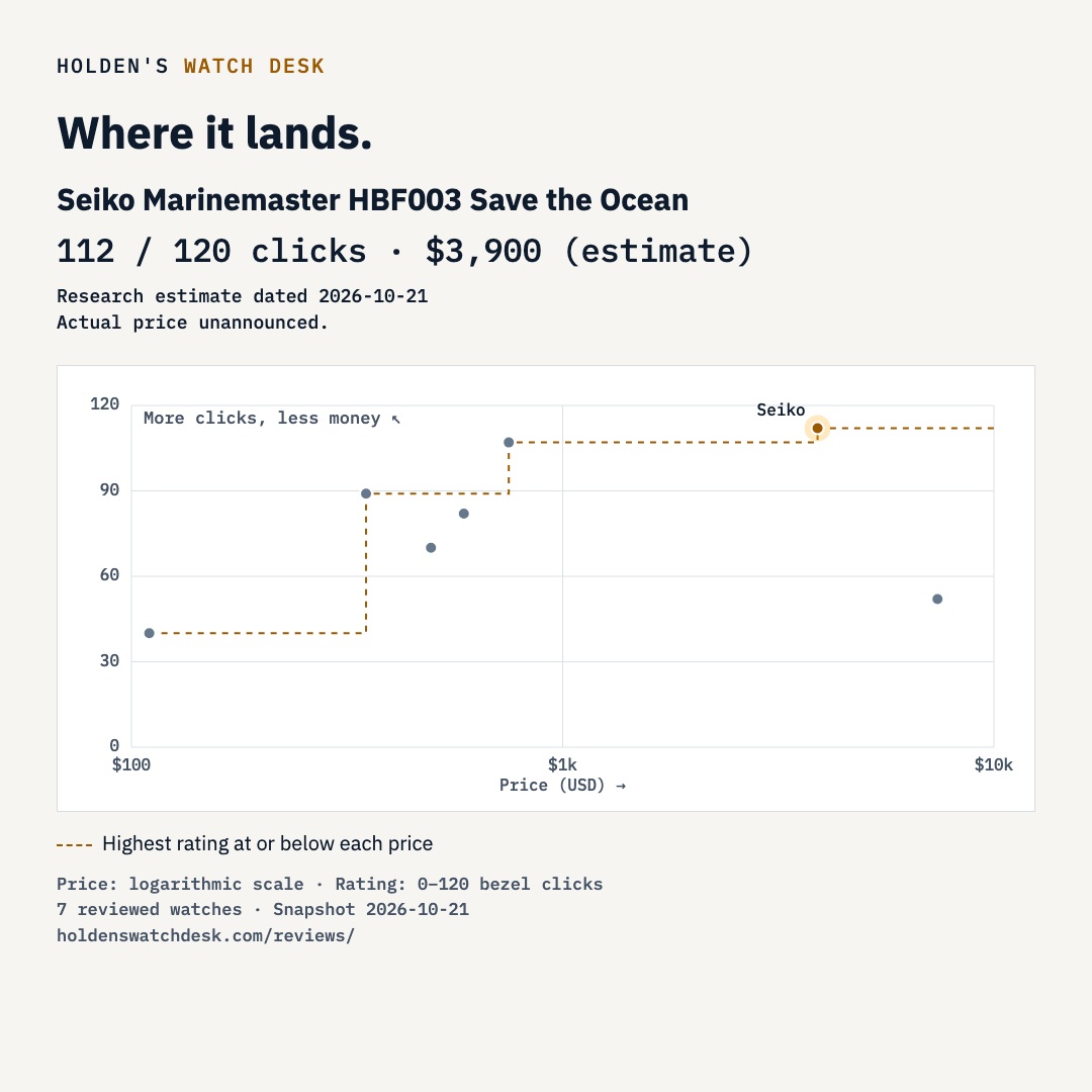
The green HBF003 is my favorite Marinemaster so far. A first look, 112/120 bezel clicks, and a clearly labeled $3,900 USD estimate.
Read review
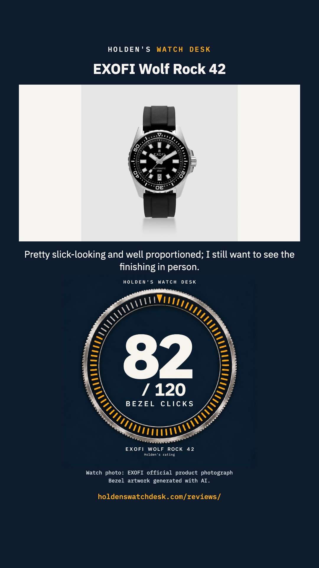
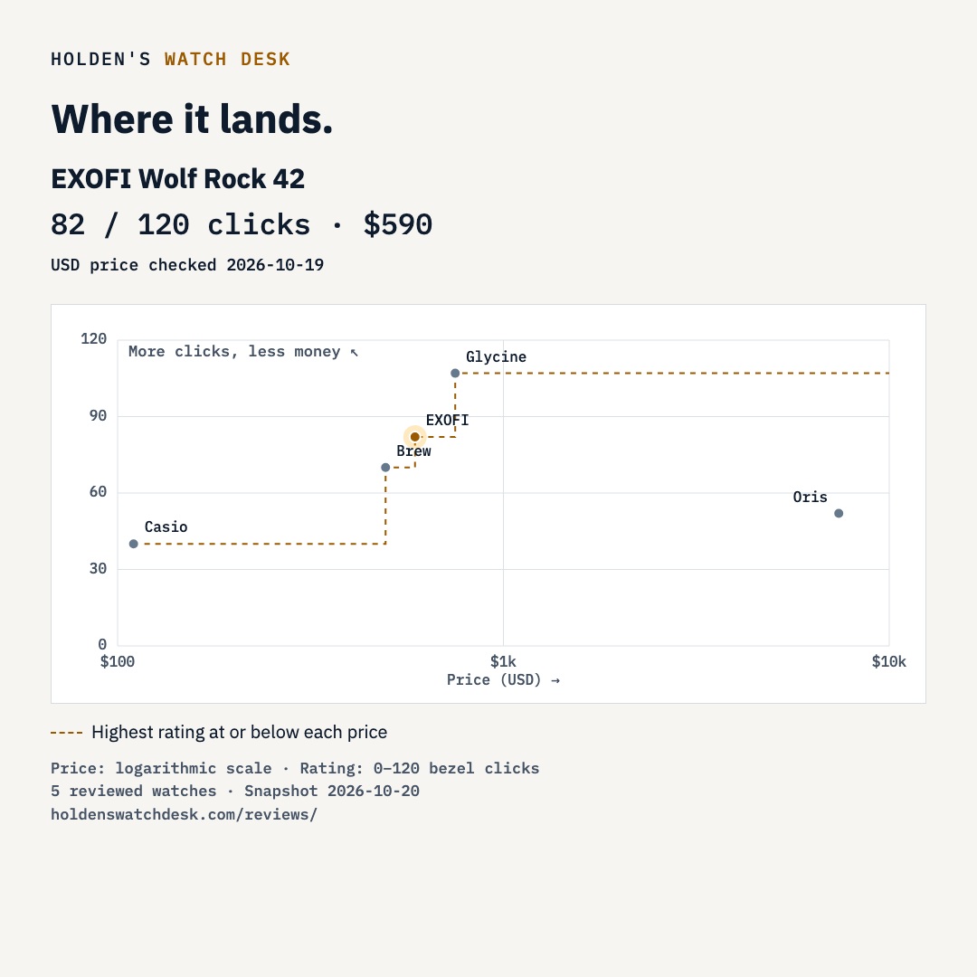
The EXOFI Wolf Rock 42 looks slick and well proportioned. My first-look rating is 82/120 bezel clicks; I still want to see the finishing in person.
Read review
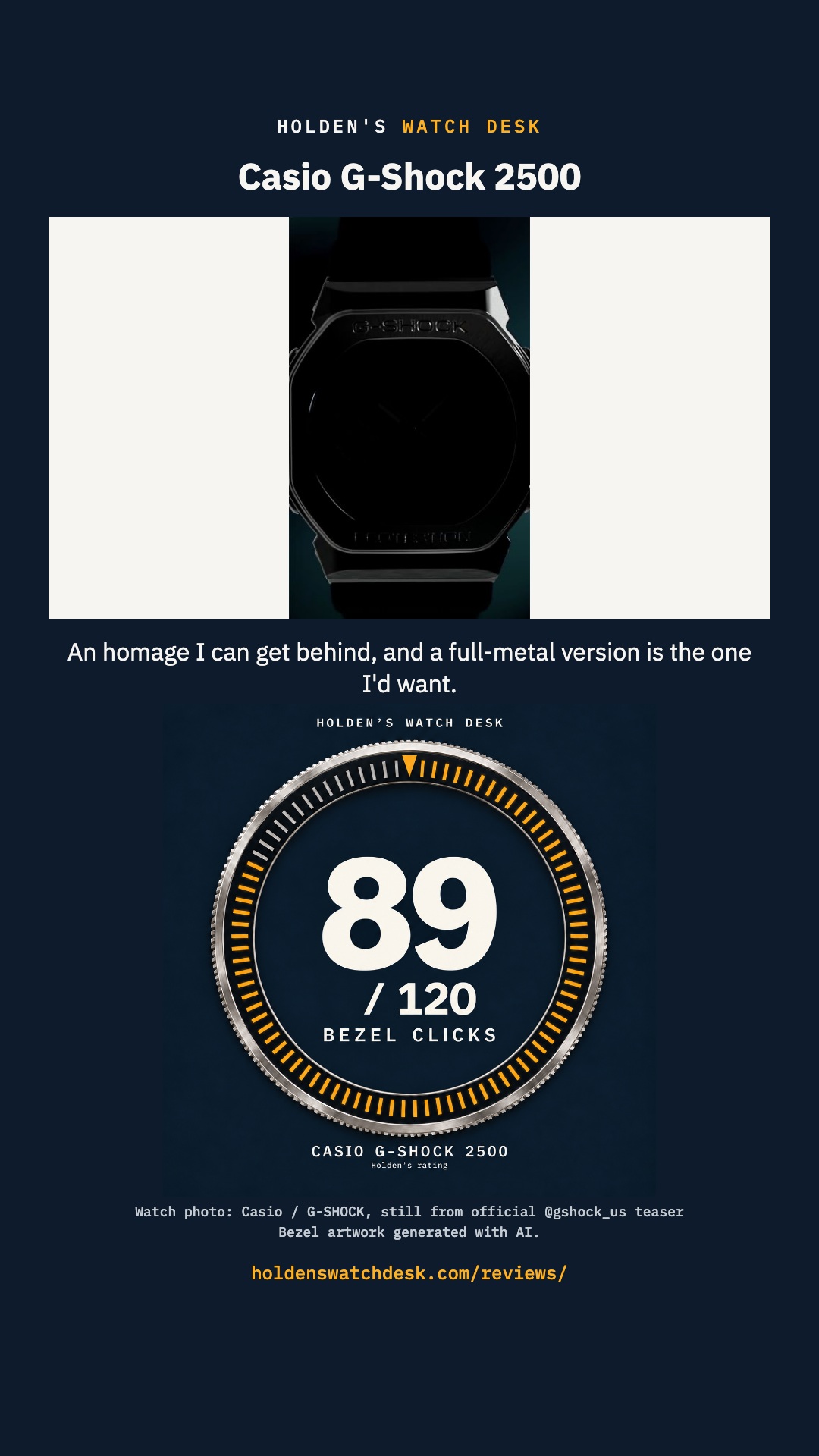
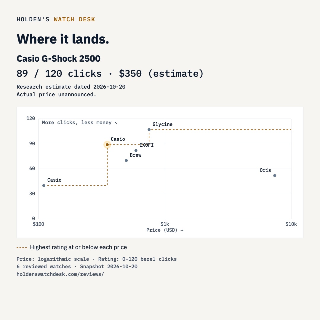
The Casio 2500 nods to the Nautilus, and I'm okay with that. My first-look rating: 89/120 bezel clicks. Final specs and USD pricing remain unconfirmed.
Read review
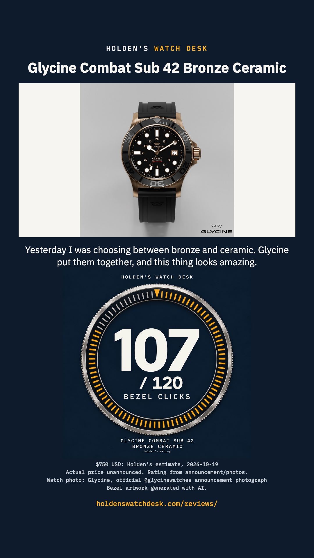
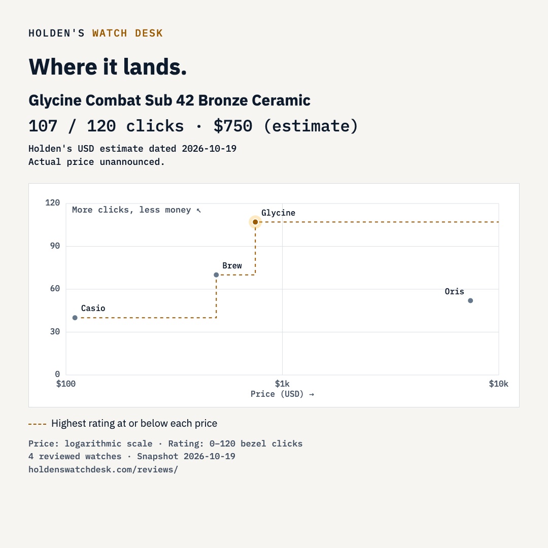
Glycine combined bronze and ceramic, and I'm waiting for March. My first-look rating is 107/120 bezel clicks; $750 is my estimate.
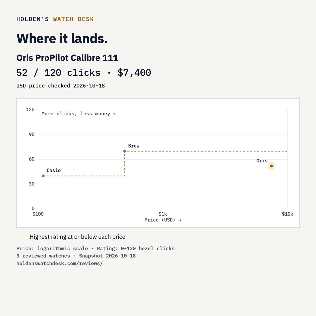
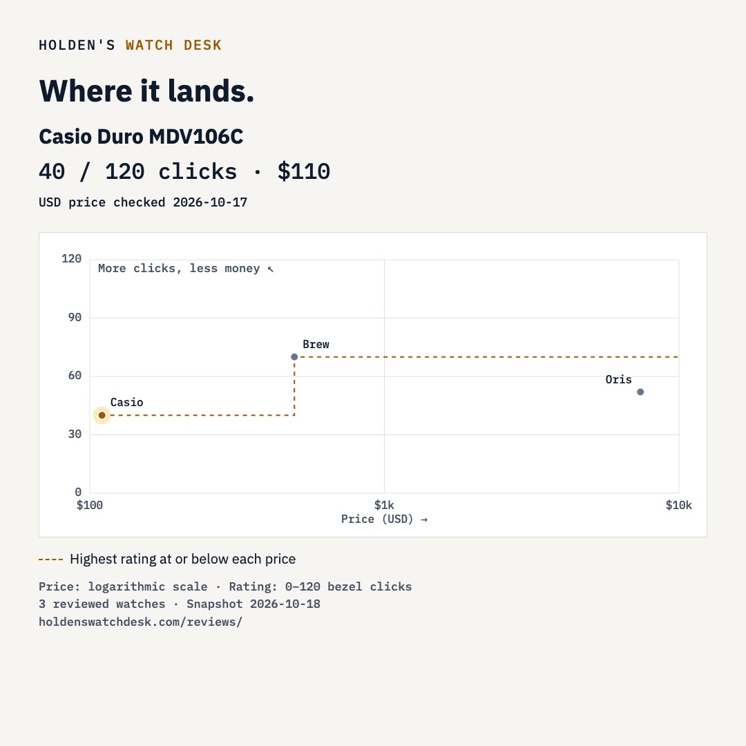
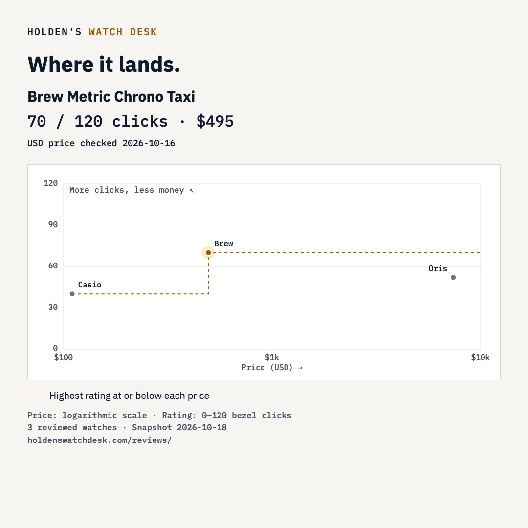
Read review9 reviewed watches. Higher and farther left is better for the money.
Zoom in, then drag to pan. On a focused chart: +/− zoom, arrow keys pan, 0 resets. Zoom reveals more thumbnails in crowded areas. The fine dashed line uses all reviewed watches, even while searching.
The line shows typical value for the price within this reviewed set and can shift as reviews are added. With fewer than three priced watches or only one distinct price, it stays hidden. Price uses a log scale. Prices are dated in each review; estimates are labeled and official prices may remain unconfirmed.
Download the watch-and-rating cards or its highlighted position on the price chart.